Maps and More!
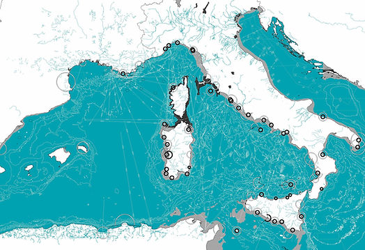
Log 53 Cover Drawing

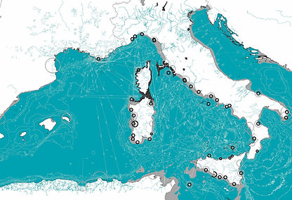
Log 53, published by the Anyone Corporation, is guest-edited by Alicia Imperiale and Manuel Orazi. It investigates why Italy remains relevant in contemporary architecture by examining its historical significance and ongoing challenges, highlighting the need to reconsider and decolonize traditional architectural narratives. The commissioned cover drawing utilizes GPS nautical data, extracted and drawn by me.
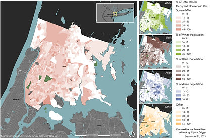
Renter-Occupied Households and Racial Composition in the Bronx, NY

This map seeks to unveil the intricate connections between racial demographics and renter-occupied households in the Bronx. Drawing on Sarah Williams' perspective that big data can serve as a tool for social justice ("Big Data for Cities is Not New"), the map aims to raise critical questions about housing inequality. Specifically, it highlights patterns of racial diversity in renter-occupied households, prompting inquiries into why rental rates vary so distinctly across neighborhoods. The map can be a catalyst for change, offering
stakeholders—ranging from urban planners to community organizers—data-driven insights for more equitable policy-making.
However, the map also poses ethical considerations. While it has the potential to empower marginalized communities by offering actionable data, there's a risk of misinterpretation or misuse. Landlords and property developers, for example, could use the data to target communities for profit-driven ventures, thereby exacerbating existing social and economic disparities. This duality is crucial within the framework of the matrix of domination. Depending on its interpretation and application, the map could either challenge existing power structures or reinforce them. As Williams suggests, the ethical use of such data demands a commitment to social justice, community consultation, and ongoing scrutiny. Layering additional metrics like employment rate and income could enrich the map's contextual backdrop, providing a more nuanced and ethically sound resource for stakeholders. Future work could also involve community surveys, collaborative mapping and additional metrics like employment rates or property ownership changes over time could be included. Such layered data could offer a more comprehensive view, aiding various stakeholders in making informed, just decisions.
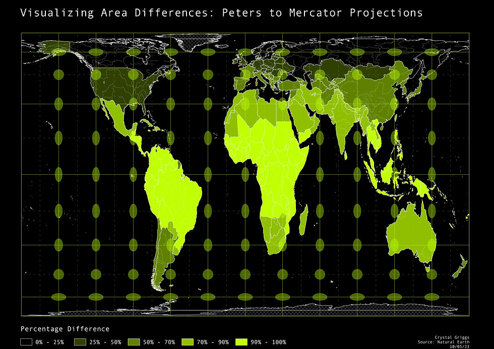
Calculating Carto-Controversy


Originally created for nautical navigation, the Mercator preserves angles, distorting areas significantly as one moves away from the equator. This overrepresentation of areas like Europe and North America can perpetuate Eurocentric worldviews. In contrast, Peters, as an equal-area projection, distorts shapes to preserve the relative sizes of areas. The Peters to Mercator comparison shows the most significant difference. Areas like Greenland, which are heavily inflated in a Mercator map, are reduced in the Peters equal-area representation. The Peters to Sphere van Der Grinten I map, however, showcases similarities, hinting that Sphere van Der Grinten I is closely aligned with equal-area properties, despite it not being a strict equal-area projection. It underscores the balance projections have between maintaining area, angle, shape, and distance. It also suggests a compromise of accurate representation of area with other cartographic considerations. The Peters to World Bonne visualization, which also appears somewhat similar, indicates the World Bonne projection's intention to preserve both shapes and areas. These comparisons hint at the inherent challenge in cartography: all maps reflect the underlying sociopolitical contexts of their time and the priorities of their creators. As discussed by Fuller, map-making is rooted in choices about what to emphasize or compromise. Conventional map projections perpetuate specific worldviews, often sidelining the interconnectedness of the Earth. By introducing the Dymaxion map, he aimed to minimize distortions and showcase the world as one unified “island” in an ocean, underscoring the need for new forms of representation. However, while the Dymaxion map challenges traditional map constructions, no projection can truly represent the Earth’s surface without some form of compromise and the tradeoffs among distance, angle, and areal fidelity. Map projections are neither neutral nor objective. Recognizing the inherent biases and compromises in these projections equips us with a deeper understanding of our world and the maps that depict it.
Analysis of Hispanic or Latinx Population and Spanish Speakers in the Bronx

The diversity within the Bronx community underscores the importance of inclusivity in public spaces and neighborhoods. Recognizing the need for multilingual signage within the Bronx, this study utilizes the data from the 2015-2019 American Community Survey 5-Year Estimates to make an argument for such installations, especially for the Spanish-speaking population. The American Community Survey (ACS) used in this analysis is an ongoing survey from the U.S. Census Bureau that provides information about people living in homes in the U.S., offering detailed demographic, social, economic, and housing statistics. By utilizing a sample of households in the U.S., the ACS provides an extensive household survey, providing data that helps determine how federal and state funds are distributed each year. Census tracts and block groups are subdivisions
of counties, with census tracts typically containing 4,000 residents. These geographical units are important in the U.S. Census data collection and provide a consistent framework for presenting statistics. For this study, data was extracted at the census level to ensure consistent scale and detail.
A notable portion of the Bronx demographic primarily speaks Spanish, which has presented challenges in navigating public spaces that lack multilingual signage. Addressing this is critical for the effective distribution of public amenities and ensuring an inclusive environment. Using data from the American Community Survey (ACS) and maps generated through the Natural Jenks classification method visualizing languages spoken using census tracts, areas in the Bronx from 2015-2019 have been highlighted with a prominent Hispanic or Latinx population and Spanish speakers. The Natural Jenks method groups data into classes that minimize variance within the same group and maximize variance between different groups. This method ensures a clearer distinction and representation of data patterns to identify areas with similar characteristics. The accompanying chart illustrates the top five spoken languages in the Bronx watershed and underscores the dominance of Spanish, emphasizing the importance of multilingual signage in public spaces. Addressing this linguistic diversity creates equal access to public resources, creating a more inclusive environment.
Recommendation: The data showcases a significant Spanish-speaking population in the Bronx, with a distinct concentration around the Bronx River Watershed where Spanish is predominantly spoken which is where multilingual signage should be prioritized. Implementing such signage will not only cater to the immediate linguistic needs of the local residents but also ensure important information is available to all and boost community engagement.

Percentage Comparison of Population High School Education Between 2011 - 2021


These maps showcase educational attainment levels in Greater Boston over time (small multiples), using American Community Survey data to illustrate changes from 2007-2011 to 2017-2021. The maps, created with Social Explorer and GIS techniques, provide a visual comparison of educational attainment by census tract. Additionally, a bar chart presents detailed educational levels within the Charles River Watershed, highlighting variations in educational attainment across different regions.
Sewersheds and CSOs

Disaggregating census data using the proportional split method presents challenges, especially at the Block Group level which I chose for a more granular analysis. However, this method assumes uniform distribution, which can skew results, especially in areas with variable population densities. Assuming uniform population distribution can lead to overestimation in populated areas and overlook the intricacies of mixed zoning as seen in this visualization. Misalignments can lead to over or under-representation of data so alignment of boundaries between spatial units is important. Verifying consistent units and coordinate systems is vital to avoid errors, as experienced when I mistakenly used the population per square mile from the American Community Survey. Zoning regulations and land-use patterns, such as the open spaces, can impact accuracy. These issues in analyzing data can result in services being inaccurately allocated, and misguided policy decisions.